Stand Design 5
Stand Design Idea 5
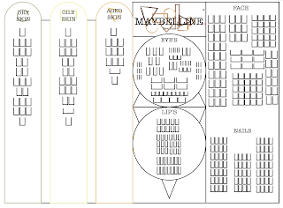
This design is the most detailed one out of all of the designs I sketched as I was trying to create a design that was able to use different shapes to make it link to the whole re-brand as well as making the stand more Unique and memorable when in the drugstore. I also wanted there to be enough space for all the products Maybelline provide as well as having space for advertising and product information. This is what I was trying to achieve in this design but I think that I had to change a few thing to reach that goal. I made the circle in the middle to be on top of the triangles, this was because I felt like using the shapes this way around would give a better look as well as leaving more room to use.
Like I have said before I really wanted to have a stand idea that meets all my goal and I love the fact that this stand dose and to the parts it doesn't meet with the best outcome like the advertising panels as there is room for them but they would be cramped in, but I can see these problems being easily resolved with some rearranging.
I feel like the biggest off put for me with this design is that like design idea three the two sides aren't balanced. I think if I was to extend this stand to make it even with the other side that is displaying the new beginners line then it would look a lot more ascetically pleasing.
Overall, I think this could be the best design out of all of them with some additional work as it has all the aspects I want in my stand as well as having the most going on when looking at it from a consumer point of view which will bring in new customers interest.


Comments
Post a Comment