Final Evaluation
Final Evaluation
I’m now at the end of my final major project and I want to look
over it all and review it to see where I might be able to improve next time. I
am going to start at the beginning by looking back at my initial ideas and why
I chose to take this project the way I did. When thinking of this project I new
that I wanted to help re-brand a make-up brand so once I had decided on the
brand I came up with lots of ideas. Then I came to the conclusion that I would
be changing the logo which I always wanted to do but then creating a new design
of packaging to help consumers with making there dictions on what products will
be best for them as well as trying to make a stand that helped look more
organised and less intimidating to customers. I created multiple initial ideas
for the logo and stand ideas. There were a lot of my designs that were
experiments and after creating a certain design I realised that it looked
nothing like what I has in my head. This is good and was helpful in deciding
what was best for the brands new look. When it came to my packaging nets I did
experiment with what net would be best but I didn’t show evidence of that
because I forgot to take screen shots when experimenting. The nets I was trying
to create were mostly based of nets I saw in a book I borrowed from collage. I
think that overall I am happy with my initial design, as I believe they are
very varied and show an array of skills and styles. This is very important to
me, as I like to get a full idea of what I might be creating so I know at the
end I tried every idea that I had.
Research was very important to me as it really helps me get a
better understanding of the area I’m working in. I find that the more research
I do the better I can approach the design. This is why I picked three different
designers that met three different parts of my project. I used the brand Fenty
beauty as a research designer. This is a brand started by a celebrity and who
created the make-up brand to include all skin tones. This has been very successful
and I wanted to look at all the aspects that helped create a thriving and
popular brand. The next artist that I look at was Paula Scher, she is a graphic designer and I wanted to look a
graphic designer as I new that would be what I was doing with the logo and the
packaging. After looking more into her work I realised that even though she has
a very loud and distinctive design style she still manages to keep the brands
message in there. I realised that even though Maybelline has a branding they
have to stick with its okay to keep some of my own style in there. This helps a
design become more recognised and apprised. The final designer I looked into is
less knows but was responsible for one of the most iconic piece of packaging in
the last few decades. He created the McDonalds happy meal packaging. The reason
that I wanted to do a research page on the man was to look more into packaging
design as it was going to be a big part of my project. I realised from this
designer that sometimes having a more simple design is most effective as long
as it has a twist on it that makes it different. It can still work the best. I
found this very helpful when it came to designing my own packaging as I went
with a more simple net design.
When it came to my secondary research I found that there was
two pages that helped me the most in my design faze. These where the page’s
titled, “ Potential clients ” and “ Brand identity in logos ” both these pages
stuck in my mind when designing. The first page was about looking at different
brands in the drug store and talking about all the pros and cons of picking
them as my client. I realised a lot about the brand in this first page, which
helped me the whole way through this project with the information helping me
determine what might be best for the brands image. The second was a very big
help for me when designing the logos. The information I learned from this page
helped me completely develop a new view on logos. After creating this page I
decided on certain features I had to have in my logo, which completely helped
focus down my designs.
My primary research was also very important and helpful with
my overall research but there is a lot less of it compared to secondary
research. This is due to it being time consuming to travel to pick up real life
research. I do think that even though there is less of it its all just as
helpful. The first piece of primary research that I took was going into my
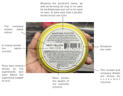
local drugstores and high end distributers like house of Fraser to take photos
of the make-up stands and there packaging that’s on display. This helped me
prove that there was a valid reason for my project. I used primary images to
show that the make-up stands in my local drug stores where messy and out of
date. The research I gathered form my London trip was also helpful for proving
that branding can be linked with all aspects of a brand and not just the logo,
but having all aspects the same theme will help become recognisable with the
consumer.
I talk more about this in my halfway review but the main
change in this project was with the way this re-brand was going to effect the
customers. At first I spoke about who my main focus was with helping those who
don’t know much about make-up and feel intimidated by the make-up on the stands
at the moment. This was still a massive part of my focus through out the
project but I also wanted to include more about skin tones and skin types when
creating the logo and packaging. This occurred naturally as an idea when
creating the logo. Then I began to focus more about it in my zine. I made sure
to use skin tones as the colour theme of the new logo as well as placing this
colour theme onto the stand as well. I made sure that the new line I created
within the Maybelline project was going to help explain what each product was
on the packaging as well as being organised into categories of products best
suited for different skin types. This allows beginners go straight to the
section of the stand and pick out items they believe they want. This was the
main idea change in this project but I believe that it helped my re-brand have
a bigger and more important message.
Once I got onto the design faze I begun to experiment more
with different media platforms. I used both Adobe illustrator and Adobe
Photoshop for the logo design, packaging design and the stand layouts. I was
still developing lots of new skills when creating my initial design because I’m
still learning when it come to digital design so even though it might have been
little thing they I learned it was still developing my knowledge. I also used a
lot of pencil sketches when it came to the starting points of my ideas. My
sketching skills aren’t the best as these where just ruff sketches to try and
show the ideas flowing through my mind. I also got to use new software for this
project, in the form of Adobe InDesign. I used this to create the booklet
format to show off my zine. I had never used that software before so it took me
some time to learn the basics of the layout and tool bar but I really happy
with my zine and I don’t thick using a software that I never used before set me
back, it just gave me more experimental time as I was figuring out what I can
do.
In this project I haven’t had to many major set backs that
have really pushed me back in my timeline but some areas of improvement that I
think I could learn from and improve next time is with my packaging. I planed
very little time for my packaging which was a bad idea. When I was planning it
out in my head I though that I would just have to draw out a net and place down
information. I only really wanted to take about a week to two weeks on it but
It ended up tacking me a lot longer then that. This was because I didn’t
realised how long it would take for me to pick a net I was happy with as well
as coming up with all the side designs. The past designs aren’t on my blog
because I forgot to take screenshots because I was rushing so much but It took
me a long time to get the pattern and designs on the side of the box’s then you
would think. I originally had two whole lines with different design but after
looking back at it I though they didn’t work at all. This was a set back but I
thought it was worth changing it as I wasn’t happy with it. Then I got set back
when placing in tall the safety information on the packaging. This was due to
me un-estimating how long it would take me to fins the correct information that
each product needed. This was my biggest set back as it eat away into my stand
design time. That is why the stands are a more straightforward 2D design. When
I next plan out my project I am going to make sure I look into all the aspects
of the project and make sure the planning is as accurate as it can be. On the
other hand I am really happy with my successes of this project when it comes to
the logo. The zine is where I really found the style I wanted to use for my
logo and to me the zine was a grate way to show the final progress of the logo
and after looking at my zine I feel like you can really understand the way I
was tacking the direction of the brand through the logo. I will definitely use
a zine in future projects as it’s a brilliant way to show off your design
thoughts in a more creative way.
When it comes to the target market I was aiming to help with
this project I do feel like I have meet that. I knew that I wanted to help
un-experienced make-up users feel more comfortable when looking to buy make-up
from a drug store stand. I came to the conclusion at the beginning of my
project that this meant the target market will be majority teen’s looking to
start wearing make-up as well as the older generation. I choses the older
generation because I know that a lot of adults age 40 + never used to wear
make-up but as they are getting older feel like make-up might help with some of
there insecurity’s on there face that have appeared with age. These where my
two target markets and as you can tell they are very different from each other.
I realised that the best way to make the new logo appeal to them both is making
it quite simplistic. This works because there isn’t to much going on to confuse
anyone who hasn’t used drugstore make-up before, but it also is relatable for
teen’s as they are very up to date with trends they will be familiar with the
simplistic style that is very popular at the moment which my newly designed
logo includes. My logo is mainly build up of line work witch is very on trend
for logos. I also included and aged skin range with products for the beginner section
because as we get older different makeup will look worse on aged skin. The only
part of this project that I don’t think is very inclusive for the older
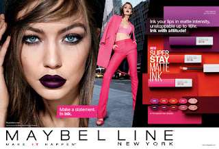
generation is that all the models for Maybelline that are hire or even have sponsorship
deals with are younger and aren’t as influential on the older generation. I
think to help the marketing part of the stand it would be a good idea to look into
models that are more familiar for the older generation so they get drawn in by
the famous faces that believe in Maybelline products. I also think that they
should hire mail models as I found in my research that the parentage of female
to mail costumers of Maybelline is 60% - 40% which is pretty close. I am glade
though as the Maybelline’s fit me campaign has just lunched a few weeks ago
focusing on the diver shade range. This means that I can include promotional
photos on the stand with different nationalities. This campaign also includes
some higher stream celebrities as well as social media influencers, which is
very relatable to the younger generation. Overall I feel like my work to
include my target market has been successful, but there still could be
improvements with the Maybelline team for the marketing techniques to help
target more older generations as well as the younger generation still.
The last thing I have to look over is my final piece but I
don’t really have a final piece, I would say I have three. This is because I
have a final design for my logo which is what I used for my final products as
well as the final design that I created with my packaging which I printed out
and used for my final packaging and then I had my final design concept for my
stand. All three things work together to create my final end product that I
could pitch to Maybelline if I was actually working for them to re-brand the
design of the brand. I would say that I did the most designing with the logo. I
showed all of that on my blog as I created seven design pages before starting
my zine where I created the final one. This was the hardest to decide on as
there were so many designs. I know that there was over half I could cut down
but there was quite a lot I liked for different reasons, but overall I picked
the final design because I knew it had all the main points that I wanted to
included. It used skin colours, shapes and incorporated brush strokes which
where all links to the brand. Then it was also simple with lots of line work,
which is very on trend so I knew that I had the perfect design. The packaging I
am really happy with as all the packages are usable but also have some fun
designs on the side panels that help link what collections they are originally
from. What I mean by this is Maybelline have lots of collection with multiple
products in. In my beginner collections I used different products that
Maybelline sell so parts of different collection are in this collection but
they are all clearly show on the box through design. This lets the consumer
know where to get it from next time they go to purchase the item as they wont
need to use the beginners collection any more. Then finally the stand design, I
am happy with the final design but I never had time to make a physical model,
which I would of, liked to do if I had more time but because of the packaging
set back I didn’t. I am still really happy with my final stand design page as
it shows in my opinion a very clear design and description of what plans I had
for the stand. This to me is very important, as I want the reader to be able to
envision the stand like I can.
Overall, I am happy with my final major project and all the
parts that I did in it to get to my final designs. I know that I had some set
backs that were unexpected but I felt like perfecting my work was very
important as I didn’t want to chose a design I wasn’t happy with when it came
to the packaging. I know that know I am happy with all parts of the logo,
packaging and stand design. I have had lots more successes with my final
pieces, as I said before I do wish I had more time to make a small model of my
stand but I don’t think that makes my stand a failure it just means next time I
will have to plan better to get everything I want done in time.


Comments
Post a Comment