The Issue
As I have said before in high end shops that sell expensive designer makeup there is a lot of help that you can get. They have professional makeup artists to help you so you can gain help from the people qualified to know best. They also have grate presentation, this is because you are paying for the name so it has to be respectable and luxury.

In this photo I went into the shops and looked for my self what the issue is that I want to help. As you can see this photo shows a bare minerals stand that was in house of Fraser. This is a high end shop that distributes all the top designers from make-up to fashion and even house accessories. This is why the presentation has to be perfect as well as easily displayed. The products on this stand are categorized with different products that are go together as well as having the same product in the same space and I know that this might sound very basic but sometimes in the drugstore there are products that are the same placed in two different places on the stand. I wanted to show this higher end stand to help explain the issue that is clearly there between the high end shops and the low end stores.
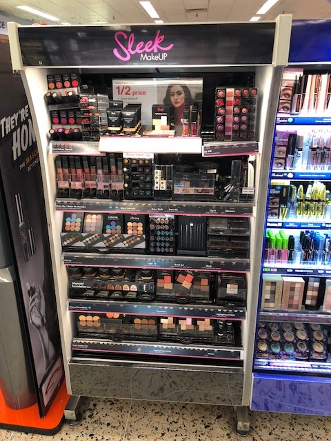
The next photos are from the stands at the drug store and even though some of these are not as chaotic as they can be as I took these photos at the end of the day so the stands had been cleaned up from the weekend rush, but I think you can still see a clear difference. If you look at the sleek stand you can see that there is no really help that stands out to say this is best for this type of skin type and so on. There is also a lot going on as there is limited space to show all the products. Then if you look at the collection stand it also has no displays or space to show what there products do they just show the products and expect people to know what that product should do for them.


The next photos are from the stands at the drug store and even though some of these are not as chaotic as they can be as I took these photos at the end of the day so the stands had been cleaned up from the weekend rush, but I think you can still see a clear difference. If you look at the sleek stand you can see that there is no really help that stands out to say this is best for this type of skin type and so on. There is also a lot going on as there is limited space to show all the products. Then if you look at the collection stand it also has no displays or space to show what there products do they just show the products and expect people to know what that product should do for them.

 In this photo you can see one of the largest stand in this boots drug store. This is the L'Oreal Paris stand as you can see it is a lot bigger then the previous stands I have showed you. The problem I have with this brand is that I find the products are not set up in a easy way to understand if you have no idea about make-up. There is a little bit of origination as they have some products grouped together like the mascaras and the eye shadows, but in my option its not easy for the consumer. This is what I want to change as I will be making the stand more cohesive for the human eye to understand as well as have the products and packaging cooperate with each other so that there is more information then just the product name on the bottles. What I though was confusing is that in there new in section at the top of the stand there is there new range of primers, they have expanded there range and have made lots more for different skin types which is grate but most people don't know what the different is which is something they would need to know when looking into buying a product. They have also place these in three different stand places which I think makes it even more confusing to someone who doesn't know any better. I would never separate and repeat product placement like this if I was on there marketing team. As you can also see most of these product don't have packaging covering the items. This to me is unhygienic as well as slightly more prawn to pick pockets as it is more easier to slip into you bag and say its you own from home. I believe that adding in packaging will be helpful for more reasons then just helping the customer understand what the product do.
This photo is from the NYX stand, this brands stand is also very big as its double sided showing lots of products but this brand dose present its self as a professional make-up brand. This is why I wouldn't use this brand to re-brand as there products and motive is to create good quality products that are affordable for make-up artist that are on a budget or just customers who are more confident and like to play around with new products. The reason I took a picture of this part of the stand, though was because one, they have better protective packaging then the L`Oreal stand using ceramic wrap but they also have used some of there stand to use to explain there contour and highlight products. This is a trend that has been going around every makeup brand for the last few years and what I like about this is that they are not assuming that everyone knows about it and allowing some of there space to be used to help sell the product. This is what I want more of in the stands with my project even though there is more to helping out the customer then just placing one demo photo but is a taste for what I want to include.
Overall I think going into the drugstore and showing the problem from my point of view will help you understand my frustration with the lower end stores. I believe that going into the stores and getting the research myself helped show the real issue.


Comments
Post a Comment