Behind The Zine
Behind The Zine
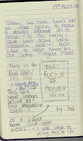
I am really happy with the outcome of my Zine. I have taken a different approach to the message in it then others. I new that I had already done most of my research quite early on so by the time we got onto the zine I didn't want to show all my research again so I chose to show the development and individual research for the new logo. I had been creating multiple design pages with ideas I had developed and from there steamed an idea that I went on to show in my zine to get a final logo.
1) The first page is the front cover and like I have spoken about before I wanted this to show how I wanted the brand to develop from what it used to be into a new 21st centenary modernised brand.
2) Then I went on to first double page spread, my main focus for this page was to show my ideas for the brand. I wanted to talk about what diversity was and why it was important to be promoting as a brand. I know there was quite a lot of text here but I thought it was necessary for getting the message of my thoughts across. I realised after working on my design pages that I wanted the new Maybelline logo to show off the importance of diversity and why there should be products for everyone who would like to try Maybelline products.
3) I wanted the second double page spread to be more visual this time showing off the key ideas I wanted to incorporate in the logo so that it had meaning behind it. I learned in my research that having a trendy logo is good but having links to the brand behind it is even better and that's what I was working out here. I wanted to place down all the ideas that I though would represent the brand as well as the new portrayal of diversity and equality.
4) The next double page spread was based more around the development of put together logos that had relations to the ideas I wanted to incorporate from the last double page spread. I think this page has a nice balance of visuals and though, what I mean by this is that even though I have a page that shows an array of all new designs I created, I also made sure to digest my three favourite designs and analyse them to see what the pros and cons of each one was.
5) The last double page spread was showing me coming to a decision on the final logo as well as developing and showing of the rules of the logo. This talks about when it should be used as well as showing it off being used in different environments. This is a more visual way of showing off the way a logo can be used, this is why I showed it off both ways. I used Photoshop to help me edit in my logo into the appropriate settings.
6) Then finally I created the back page to be linked to the front cover. I used the same image display that I created for the front cover so that it felt like you had started and ended showing the same message. I used the wording I did to show that you have just seen the future of what the brand can become and now you have to step into the future to show the rest of the world that we should be moving forward with becoming a equal world.
Know that I have gone through every page showing the flow I intended for showing off the final logo I hope my vision for the branding of Maybelline is clear. I wanted this zine to show my journey in creating the final logo. I wanted it to show the importance of my idea as well as the thought I put into the design aspect of making it look on trend, meaningful and simple so it didn't differ from the original logo to much. I am really happy with my final logo and I think creating the zine really helped me come to a better conclusion of what was right for the brand.
Know that I have gone through every page showing the flow I intended for showing off the final logo I hope my vision for the branding of Maybelline is clear. I wanted this zine to show my journey in creating the final logo. I wanted it to show the importance of my idea as well as the thought I put into the design aspect of making it look on trend, meaningful and simple so it didn't differ from the original logo to much. I am really happy with my final logo and I think creating the zine really helped me come to a better conclusion of what was right for the brand.


Comments
Post a Comment