Stand Design 4
Stand Design Idea 4
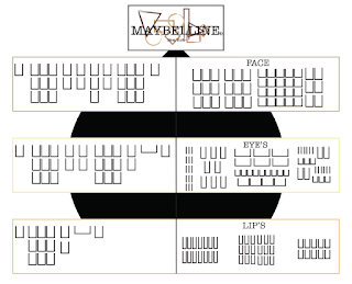
I think this design was the one that stayed most true to the original sketch I did with nothing changing a part from the little point I made at the top to hold the brand logo up.
When looking at this design I have mixed feelings as I really love how simple it is without being so different that space is lost or it looks to over the top for a drug store make-up stand. I think when you look at it you can see it in the drug store being used as to me it look consumer friendly.
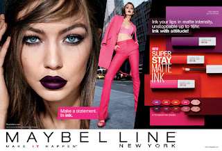
My problem with this design is that the new line I have created for this re-brand hasn't really got a clear space to be showcased as they will be sharing the same space as the rest of the Maybelline line. I don't think this will help showcase the full potential of the new rang I created. I also think that even though there is grate spacing for the new range to have diagrams and information panels there isn't any room for that with the existing Maybelline line as well as no room for the advertising panels that bring in consumer attention using famous faces to advertise the make-up brand.
Overall, this design has potential but there are key parts that are missing which I would want on my stand, like the room for information panels and advertising spaces, even though I really like the simple but different design I would have to be able to add in them details other wise it wouldn't be right for what I want.


Comments
Post a Comment