Logo Design 7


1) I wanted to try and recreate my sketch design as much as possible so I decided to make my own M so that I could make it as bold as I had drawn it. I started of with two of the same size rectangles that I drawn with the rectangular tool (M).
2) Here I am copying and pasting more of them rectangles and lining up like i have done in the past to make sure they look like a real M. I used the rotate tool to turn the middle panels around.

3) This is what it should look like when I am finished placing down the rectangular panels.

4) Now I am selecting all of the shapes and clicking on the pathway tab to click the divide button.

5) Then I am clicking down on the M again with the right button on the mouse and clicking on the un-group button on the drop down menu.

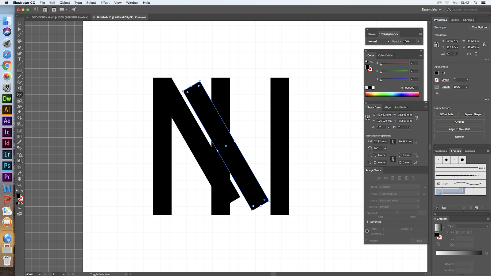
6) What I had to do next was use my select key to pick up and delete the parts of the M that don`t need to be there.

7) I cheeped doing that in till I got to the stage in this screenshot, this was now clearly a M so there was no need to delete any more.

8) Next I started to add in the shapes in the background of the M. This was easy enough to do using the ellipse tool for the circles. I made sure to hold down the shift key so it as a perfect circle. I moved in to the same position as i drew it as well.
9) To create the triangle I used the pen tool (P) but I turned on the grid to help me make it look even and realistic as using the pen tool can create uneven dimensions. THen I used the rectangul tool (M) to make the last shape but as I wanted this shape to behind the rest I had to pull it down in my layer tab.


11) Here I am adding in the last step and adding in the name logo. This had to be vertical so I used the vertical type tool and created a text box on the side of the triangle. This is where I put it in the sketch so that`s why I decided to place it there.

1) All I did here was change the colours to see what it would look like with the skin tone colour theme that I wanted to test out again.

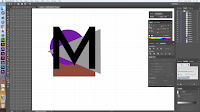
1) The next idea I wanted to play with was to use a different type of M, so that`s what I did using the pen tool to create a capital M. I also added in the shapes like the once I used in the last logo design.

2) I wanted to add more colours into the shapes as I know that there is more skin tones the three so I started to add in more shapes so that I could add more diversity into the colour theme. I added in a diamond shape which I did by using the pen tool, like the triangle.

3) I looked at the logo to see what I wanted to do next and I came to the conclusion that the pen M was to thin and was hard to see, so I selected the M and turned the stroke size up to 10 pt.

4) Lastly I added a box around the whole logo because I wanted to see what it looked like as the last logo didn't have one. I created this with the rectangular tool (M) but after I also turned the stroke size of this up to 10 pt as well.

1) As I really liked the logo with more shapes behind it so I used it again to create a new logo development. I copied this over.

2) Then I brought over the M I made in the first logo design to see If it would be bold which it was but then I had to figure out if it covered up to much of the shapes.

3) Then I moved onto the name logo and the border. I chose to use a lot of contrast in this development as I used such a bold M in this I went with a line square bored make with the (M) key. Then when I added in the Maybellien and the New York text I used the type tool (T) to create the stander wording.

1) I wanted to try this shape design with out a border so I copied over the shapes so I could create another logo with this.

2) All I did next was add in the name logo that I created. This is my favourite so I wanted to see if it worked with this logo as well.
 1)This last logo development was also based of the shapes from the last development so I started this one off by copying it over.
 2) The next stop was to add a M in and I wanted to do this with a paint brush. This was to link back to the art form of makeup cosmetics. This was the brush that I picked.
3) Next I wanted to test out the sizing of the width of the brush. This is why I played around with the % and showed them to show my prose.

4) I decided to go with 13% witch I really like but if I chose to go with this design I can still change and play around with it. I really liked the effect it gave linking it back to the art form of the brand.


Comments
Post a Comment