Zine Forth Double Page Spread
Double Page Spread

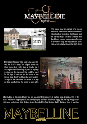
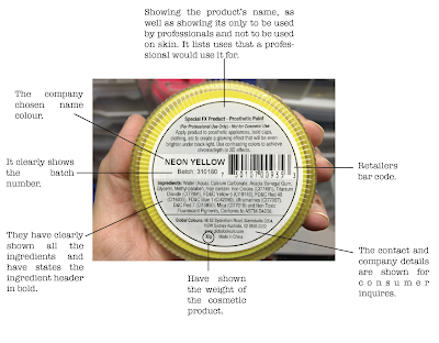
This is my final page in my Zine. I wanted my zine to show the progress of my logo design and this was the final page to showcase the final logo designs and the rules that go with them. I wanted this page to be easy to understand and still pleasing to look at even though I new it would have to be filled with information to explain the rules I am setting for the logo. I still went with the same layout as the other pages having the black and white split page with the Maybelline name in the corner of the page. I am happy with this overall and believe that my zine shows a natural progression of how my logo was designed with a professional feel.
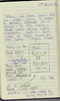
This is my sketch with the layout plan of what I was going with and I feel like I stuck to this quite well, the only main differences would be on the second page I added text to it as I though the images needed explaining to show what I was going with them. I made sure to stick to one side being about how each logo souls be used, calling this the rules side and then having the other side showing examples of my logos in use. I think this layout really helps show my logo being used in real life.


Comments
Post a Comment