Brand Identity In Logos
KEEPING BRANDS IDENTITY
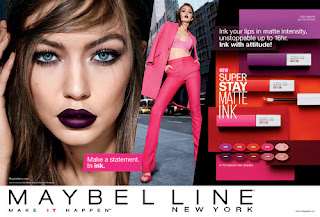
As I am re-branding Maybellien and that is a very well know long lived company I need to make sure I am keeping the identity alive but just bringing it into todays design level. This is why I am going to be looking at different studies and blog posts to see who i can do this in the most beneficial way.
The first study I am going to look into is a study where 156 Americans were asked to draw out well know logos. This was to test what features were most easy to remember and what were not. The people taking part in this was between the age of 20 - 70.
This image is from the study. It shows you all the 156 participants attempts of the burger king logo. This was very interesting as they did this for 10 well known brands with distinctive logos and the results showed that colour is the most important thing when it comes to the average consumer. It showed throughout the study that people was getting the colouring of the logos the most correct, even when they were very off the were usually on point with the colours. It showed that around 80% had picked the right colour schemes, compared to shapes being a lot less recognisable. What I have learned from this study is that when re-branding you should stick to the same colour theme as people remember that the most, but my only problem with that is Maybellien only uses black and white. They used to use a lot of dark blue but after looking into them I have found that they don't seem to be associated with it anymore. This means that I cold create a new colour theme as it is better to stand out from the competitor. My logic is that if the public remember brands logos from the colour the most I should make it have a colour theme like no other drugstore brand so that people remember that one as that colour. I find that most companies in the drug store use black and white or pinks and black and white witch means that I should come up with a colour scheme that is different to the other big competitors. Another element that I learned from this study is that if I want my logo to me remediable to the granular public I will have to make a logo that is simple enough to remember but also be able to stand out in a crowd of thousands of other logos. It has to make a mark on someone so they remember it, this shows how hard my challenge ahead is.KEEPING THE DETAILS
Another article that I have found on this website is about keeping the details of the brand in the logo so that the mark has though behind it. I think this is very important which is why I will be incorporating items in my logo. These could be links to makeup as well as the link New York city.
An example of this would be this logo which was made in 2017 for Canada Snowboard. This logo is very clever in its design as it has three elements to it that link to the brand as well as still being very simple and not overwhelming to look at. The white section in the middel is part of a maple leaf which has been put upside down, this is linked to the brand because maple leafs are on the Canadian flag. The reason it is upside down is because then it can look like a mountain peak. Its also white to represent the snow on the mountains as to snowboard you need snow. The last point that makes this logo so well though out is because of the black diamond that the it all sits in, this is also a link to the brand as in snowboarding you have different levels of difficulty on the mountains which are categorised by colour as well as shapes and black diamond is the highest level this is why it all links so seamlessly. If you looked at the brand and saw that logo i think most people would get the links.
There was others on this page that were very cleaver but in the way the logos were designed but what I think I cant take away from this study is that I need to make sure I am making links to the brand that are complexed as well as details that are very easy to understand making people realise the cleaver design. This will hopefully make them remember the design better.
There was others on this page that were very cleaver but in the way the logos were designed but what I think I cant take away from this study is that I need to make sure I am making links to the brand that are complexed as well as details that are very easy to understand making people realise the cleaver design. This will hopefully make them remember the design better.
-https://www.logodesignlove.com/


Comments
Post a Comment