Magazine Research
Magazine Page
This is a Magazine that I found on Pinterest, I picked to analysing this one as I really liked the overall look of it with the geometric theme that ran through the pages.
This magazine uses negative space around the text. I find that I really like the look of this as the images are backed with negative space as well but it is being filled with colour witch makes the image become bigger and able to fill more space in the magazine layout. I think they didn't do this with the text as they wanted the writing to be a stand out and easy to see as it hasn't got a colour filling its negative space.
This magazine article is about plant life and nature. If you look at the typography used then you will see that they have used a very clean and simple font style. This is perfect for what they are putting forward. This magazine is using the same font through the headings and title showing that they are the more important information informing the reader what parts they might be interested in, then you have consistency in the article front as well. This is a good example of doing the typography right as if they went for something bold and cartoon like it would be completely out of style to the rest of the magazine. It would send a confusing message to the reader as well as setting the wrong atmosphere for the rest of there reading experience.
The next think that I'm going to look into about this magazine layout is the colour scheme. I want to analyse the colours harmonising and the colours contrasts that they might have putted into the magazine. This magazines colour theme is based on two colours a light blue to green and a light pink. Theses could be considered contrasting colours as pink and green are but this is not quite a green bits on the edge of contrasting. I think that the use of pink was intentional as they are using a lot of green flowers in there images as that is what this magazine is based on. There is also use of a copper toned pink in my opinion which is quite trendy at the moment with gold, silver, rose gold and copper all being used as accent colours in colour themes. Overall I do like the use of these contrasting colours but I believe that this is because they are lighter version of the colours this makes it more of a subtle contrast.
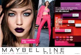
This Magazine is quite different then the last one we looked at and this is for many of reasons one of which is that it uses way more negative space. The last one we looked at did use negative space but this one has taken that to another level using very limited space for the text and dedicating more space to borders and images. The second double page spreed has more text on that one but it still has consistent use of the negative space making the page sill have lots of negative space around the borders.
The next thing about this is the typography. There is consistent use of two different texts. The first is the one used for titles and in the logo that is placed on the front of the magazine. There is nothing amazing about this typography as the letters are clean and bold. The unique thing about this is that they place the letters out of a structured line. I like this as is adds to the whole theme of the magazine. I would say that it is very on trend with the layered images and edited photos so this type of typography works well in my opinion as its simple to not draw to much attention of the bright edited images but it also is fitting in the style and the theme of the magazine.
Another difference is that this magazine is using harmonising colours, the two most prominent colours in the magazine is pink to purple and red to orange. These two colours are harmonising colours which means that they work really well together. They don`t stand out against each other as much as it would do if they were contrasting but because they are harmonising dose not mean they cant be bold. The last double page spreed has a bright orange toned red against a lighter toned pink which is showing how using the full range of a colour can create a contrasted even when being harmonising.
Overall looking at both magazines I have been able to find good using of negative space, typography and contrasting and harmonising colour themes. This has given me a wilder knowledge of how important these elements are in a magazine as well as how I could use them in my zine to create a piece of work that I am proud of.


A detailed and analytical discussion Abbie of your researched examples and good use of subject terminology relating to the layout and composition of the spreads.
ReplyDeleteSPAG: Check when using the spellchecker that the correct word is used - e.g. which not witch, against not ageist, harmonising not harming. Check use of apostrophes for possessive - i.e. 'This magazine's colour theme'