Stand Design 1
Stand Design Idea 1
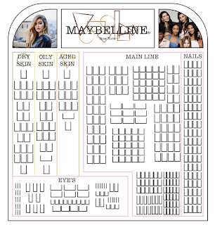
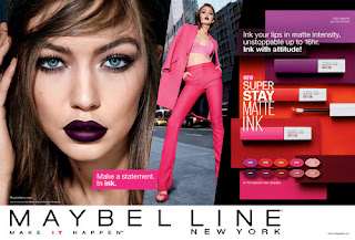
This first mock up of my sketch came out like I though but there was added in parts that I added in when seeing an opportunity. These where the advertisement borders that show off the images from Maybelline campaigns. I thought that after adding in the logo panel that there was grate opportunity to add in some adverts that I originally couldn't find a place for in my sketch.
I like that this design is simple with its still rectangular shape but adding in the rounded edges makes it different from the original stands. I also really like that the basics range is separated but still works next to the rest of the range. The way the eye's section is also separated from the rest of the make-up line is a pro in my opinion as the eyes are an extra part of make-up and its a skill that most find hard, so having its own section allows the stand to have help guides and information next to the products.
The parts I don't find grate about this design is it's not very unique which is okay as all the other stands in the drug stores are the same rectangular shape, but I think that having something more unique will be more eye catching as well as memorable to the consumer. I would like to take parts of this design into a different sketch but I think that this design is to simple at the moment to make an impact on the consumers.
Overall, I really like the placement of the logo with the advertisement pictures next to it, but I think for this re-brand to be worth spending the money on a new stand there needs to be more details in it. I think that having a more creative shape or detailing would be better for the re-branding campaign.


Comments
Post a Comment