My Stand Sketches
Stand Designs
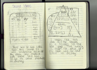
After looking at the Maybelline stands in retailers like boots and super-drug I started to sketch down my own designs. These were just quick sketches with brief description about what I was thinking behind each design.
This show the first two sketches. These are both quite different as the first one is a lot more simple with just some slight differences to the original stands but there is nothing to unique about it, but the second design is very different to anything I have ever seen in the drug store. I used the idea of shapes from the new logo to incorporate into the design as I though it would be a good way to link the new branding into both re-designs.
After designing the second sketch I really liked the idea of using shapes in the stand but I though that the first design might have to little space for products as it is using up more negative space. This is why I came up with linking up separate shapes together to use up more negative space but still doing something different then a plane rectangle.
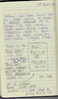
When sketching out these stand ideas I created the forth one as more of a simpler design. I was going to make it just a circle but I realised that would create a lot of negative space to, so I added in three horizontal rectangles to create more space. I think the problem with this one would be that there is no clear space to put the three beginner ranges. The fifth idea thought is a lot more completed. I really like this idea as it not boring but it still has the three columns to place the beginners range with space to add displays advertising the items in the ranges. I think that if I was to pick this sketch I would have to balance out the stand to make it look more evened out.


Comments
Post a Comment