Final Stand Design
Final Stand Design
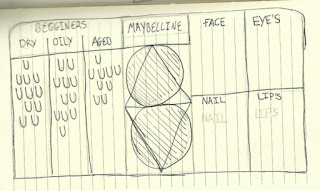
When looking at the last design idea I realised that it was the perfect design if I was able to make the small corrections I mentioned on the design page. This is why I wanted to go back and look at the design to re evaluate the design. I new I wanted to make the right side the same length as the left so it seemed more balanced. I made the the whole stand connected with a rounded edged rectangle. The reason that I did this was so I could get ride of the semicircles that were above the beginner ranges, after looking at this again I realised I really didn't like the look of the rounded tops next to the square corners. This is why I changed the back to the rounded top rectangle. I used this from my first stand design.
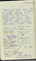
This sketch is showing what the in depth look at what the advertising stand will be. These domes will be holding new products launched in the Maybelline family. I have tried to sketch out a 3D dome to show how the flat image I sketched before will look when created in real life. I think this is a key part of a make-up stand with most competitors having them to. It is key to help launch a product.
This sketch shows the thought behind the new beginner range shelving. I desided to space them out so that I could section of each product. This is useful because it helps to see what products are different as well as giving me an opportunity to place images behind the wall of the sections. I designed a sistom that would allow the consumers see the application process. This was important to me as its another step to helping new users of make-up with the understanding of how they could use it themselves.
This is the final design for the stand. I am really happy with this design as it meets all the points I new I wanted to include. First of all it is appealing to look at witch is very important as costumers need to be attracted to it to want and look at what products it has to offer. It also isn't boring because of that, I found a way to add in shape and unique design with the middle section which I have designed for the advertising use of the stand. The stand needed more space to showcase of best selling products or new additions to the Maybelline line. The domed circles will be used for holding new products with all the appropriate add campaigns. The side panels can also hold images with celebrity endorsements to help boost consumer interest. I have made the two sides the same size, one holding all the newly launched beginners line that I created for this re-brand as well as the per existing line on the other side that I have split into four sections to make to more organised for the consumers. Lastly I want to talk about the use of shapes, I am glade that I was able to use shapes with both the new line as well as the advertisement section. This means that the use of the new logo will be visual linked to the rest of the new developments in my re-brand. When looking over the three sections I have changed about the Maybelline brand I am happy with how they all work together with the stand being the last step in that. This stand shows off the new logo as well as holding the new beginners range that helps first time customers with what might be best for there skin, which link to the meaning behind the new logo as I wanted there to be a inclusive link with all of my designs.
Overall, I thing creating this design was definitely the best decision for me as it includes everything I was looking for and that's why I would chose this design to progress with if I was able to make this stand.


Comments
Post a Comment