What I Want For The Packaging
The Packaging Target Points
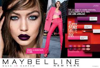
When designing the product packaging I want it to be for the three starter ranges, dry skin, oily skin and aged skin. This is the part of the project where I`m not trying to be the most creative with the shape of the packaging as I don't want to make really different packaging but I want to have different designs on the packaging that stands out from what Maybelline would normally do.
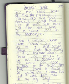
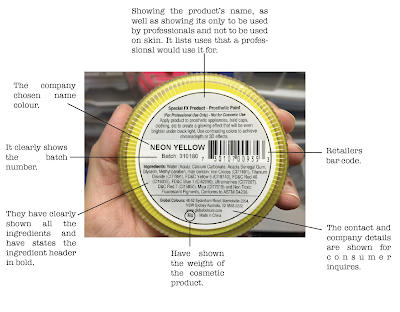
First I had to look at what colours I wanted to use. I know that I want to use different colours for each range so that its easy to know which colour you should be using. This helps if the stand got messy and there was products in the wrong row you would know elementally because of the different colours on the box's. I have talked about this process in my journal as that's were I first planed out my ideas but I though to look up dry skin products to see what other used when being associated to try skin. I found out that most products were light green colours so I decided to try it could and I really liked that outcome. This is when I picked green for dry skin packaging. Then when it came to oily skin I went strati to yellow as its a harmonising colour to green and I wanted the colours to work well together because when there on the stand I want it to be approachable and if its to bright I don't think it looks approachable. Then a harmonising colour of yellow is orange, so I wont to use orange for the aged skin range so that all of my beginners ranges work well together.
Next I want to think about what I'm going to do to that design on the packaging that makes it fun and different but not to over the top. I want the design to be simple but related to the products. I think I will try and make the box's show the ranges that Maybelline have more clearly. What I mean by this is that Maybelline have quite a few collections that have products under on name. An example of this is the fit me collection. they have powders, foundations and concealer under the fit me name. I want to show that all these products are related by having them have the same style of packaging. I want there to be some type of design on the packaging so the once that are the same collection will have the same designs.
That's my first thoughts about the packaging for my Maybellien re-brand. I really like my first thoughts on it, so I hope that they turn out like I am imaging them but I am open to change if I think of new ideas whiles designing.
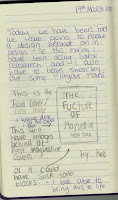
This is the notes from when I first thought about what I wanted for the new packaging. This shows where I talk about the colour theme and when I was playing around with the idea of keeping them harmonising.


Comments
Post a Comment