Colour Swatches
Colour Swatches
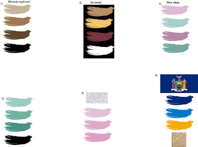
I wanted to play with the colour schemes so I could analyse what was the best one was for my logos. every element of my logo has to have a meaning otherwise there would be no point in making the change. It would just be confusing for the consumer and for no grater reason. I have played with some colour themes here that i have already used in my design sheets but there is also some new ones. These are some that I have though to be on trend as well as ones that might have a links to the brand. I hope that at the end of the page I will have come to a diction on were I wont to take the colour schemes of my logo and re-branding.
 This first colour schemes that I put down was one that I have already played with in my design pages, seven and two. What I like about this idea is that it has a positive and impactful grater meaning. What I mean by this, is that I would like to use skin tones as the company colours. There are thousands of skin tones but in this example I am showing the very basic range. I think that the message that this could send would be a lot bigger then just a logo. This is why this is one of my favourite so far but after looking into my others five I might change my mind.
The next colour theme is another that I have used in my design pages previously. I haven't used this ecsact one before but in most of my design pages I have used blue tones whether they are dark or light to link back to the original Maybellien. In this day and age Maybellien dose not asoseate itself with dark blue which they used to use all the time. The logo used to be in blue not black and a lot of there packaging would be blue as well. This is why I keeped using these colours to add in colour as customers might not really notice as it goes back to using blue again, it wouldn't be as hard for them to understand. I have made it so that the blues would be more divers and not just one colour so that the logos could be more dimensional.
The next colour swatches I looked at was this set of colours that I picked based on what I though is quite trendy at the moment. When I was looking into it I found that there has been a lot of muted reds and yellows in resent fashion lines. This is why I made up a colour swatch with them colours. I added in a muted brown cream tone as well as a plain white. These were to use as assisting colours agenst them two main colours. I do really like the look of these colours together but the problem that I have with this is that its trendy now but what happens in six months when there is another fashion week and the world of fashion is changing what is fashionable. This means that I am worried that I will be changing the logo to meet a trend that is constantly changing meaning it will never stay on trend, so that should never be my solo goal with this colour theme.
This next theme is also another on trend theme with logos. This is one that I have picked up on with small indie brands that are linked to beauty and skin care. This colour theme has also got a texture as well as a colour. This texture is a silver glitter. I picked silver is because I think it works best with the light pinks, but I new I wanted a glitter in this colour schemes as that is what I am finding most popular with smaller brands. I think that this is a really girly colour theme and that`s why its popular with makeup cosmetics. The majority of the public who were makeup are going to be quite feminine as its a passion that is seem to be girly. This though inst the case for everyone though as there is lots of people who were light makeup to make them feel better but don`t really care to collect it. That is my one problem with this colour theme as one of my goals with this re-brand is to be more appealing to beginners and most older beginners are not to fussed with makeup in the first place its just that they are beginning to worry about there skin changing so they wont some simple products to help. This means I want the branding to be appalling to as well and i`m not sure this one will.
This colour theme that I have created is based on boys and girls / women and men. This is using the common though that boys are blue and women are pink. What I am talking about here is that we live in 2018 and both boys and girls can were makeup and not just boys that want to were a full face of makeup. There is a lot of boys / men that were small bits if makeup to help them feel more confident just like girls / women do and there should be no stigma around it so my idea with this colour theme is that both genders feel included and like they can find a product that will work for them. This theme is defiantly a contender as i really like the idea behind it and the colours also are not ugly to look at when using for a logo and brand identity.
The last colour scheme that I created was based of the state of New York where the brand is based. This is a big part of the company as they even state it in the brands name as it is know as Maybellien New York. What I did to get this colour theme was find an image of the state of New York flag and using the eyedropper tool collected the colours from the flag. The colours that I though were most prominent were the two tones of the blue and the yellow on the dress. I know that there is also a lot of red used on the dresses but I didn't want it to be blue and red as it could be though to represent the USA flag instead. I also added in a gold, this was for the golden bird in the top of the middle. This then also links it to the trend of the glitter that I spoke about in the forth colour scheme. I`m not sure how well this will work but if I can use it it would be another really good underlining meaning that I feel like the brand and consumers will appreciate.


Comments
Post a Comment