Logo Design 5
1)The first logo I produced was based of my sketched so I started with the rectangular tool (M) so create a shape I was happy with. As you can see I made a rectangle.
2)In this shot I am beginning to form the skyline that is mean to be in the background. At this point I have already done most of the line work with the pen tool. I drew this based of the really New York skyline but did do this one from memory so it isn't accurate.
3) Here you can see the finished skyline.
4) The next task I had to do was to add in the diagonal text, from my knowledge I couldn't remember how you can do this is one text box so I did this individually. Making one text box putting in the letter and then placing it in a diagonal placement.
5) Next I added in the NY wording on the right side, to do this I had to make the rectangle a little longer. I did that then used the text tool to add in the NY I made this a lot bigger then the Maybellien wording as it had more room to fill and i also wanted it to stand out.
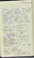
6) The last step was to add in more Maybellien text. In my notes on the final page I spoke about why I did this.
1) For the next logo I copied and pasted the last logo. I only copied and pasted the box and skyline. Then I selected it all and shrunk it down making it a smaller width.
2) Then i added in the diagonal Maybellien name but this time I only needed to have one as the box's width was smaller. This was the reason i developed the first logo to a smaller one.
3) What I had to do next was add in the N and Y but I knew that I didn't want to do the same NY as the last logo as I wasn't a big fan I though it looked to bold for the rest of the fine line work. This time I added in the N and Y with the text tool again but put them on top of each other so that the space would be filled but would be half the size. I liked this a lot more as it took up less space and it also worked better as know there is a space between the N and Y which shows how each letter stands for a different word. This was the last step for this logo.
1) When I was finished with the last one I knew that I needed a way to incorporeal colour into the logo so I used the (M) key to make a box that was the same size as the box with the skyline in. Then I moved it down ready for the next step.
2) Then all that was left to do was copy and paste the whole of the lest logo and drag it over the coloured box we just made. Know the background of the logo has colour.
1)The next logo I went onto was once again a longer rectangle, this was made with the (M) key and I made it bigger then my first logo. Once I was happy with the shape of the outer box I copied and pasted over the skyline, then fitted it into the box in till i was happy with how it looked as I didn't want it to look like the skyline was to stretched out, that would of looked really unrealistic.
2) Here I am placing in the NY but this time I have changed it again using the N and Y with the pen tool making it more thin and I can control the hight and width of each letter.
3) Then all I had left to do was add in the Maybellien's name logo. This time I wanted to add in a different logo of the name as I wasn't liking the diagonal name. It just didn't flow right for me. This is why I copied and pasted in my favourite name logo to see if that one would work, and it did in my opinion.
4) At this point I though that the logo didn't look finished and I wanted to add in colour so I decided to add in a gradient, to do this I selected the box that has the skyline and name logo in and then changed the fill colour to a gradient. In this screenshoot you can see the default is a grayscale colour theme.
 5) The next step was to make this the gradient that I wanted and that was a dark blue to purple colouring. This was to represent the dark sky. Then I had to use the gradient tool to flip the colour order round, that is what you can see in the screenshot, the line that is going own the middel shows the way the gradient will go.
6) This next shot shows you the colours I had on the gradient as well as the percentage of the transparency of it. I made the transparency lower as the colours were to intense for the skyline to be seen. This was the last step as now i was a lot happier with the look of it as it had more to it then my original design.
1) After I had finished the last logo I though about using the name Maybellien logo from it on another one of the small Maybellien logos that I made before the last. This is why I went back over to that part of the development and copied and pasted the logo over taking out the diagonal Maybellien wording.
2) Then I copied over the name and resized it so that it fit into this space.
1) Thinking of the next idea I though about turning the rectangle around, so that is what I did. I made this with the (M) key again.
2) I added in the skyline into the top where there the NY would also go later on. I used the line segment tool (/) to create a separation for the skyline to be placed. After I did that used the pen tool (P) to draw a smaller version of the New York skyline that I have been using for the rest of the logo designs.
3) Then I added in the N and Y. I made the N and Y with the pen tool (P) again, but this time I made the edges rounded. I wanted them to be rounded as i though it looked to harsh against the skyline. This was done with the (A) key allowing me to get the options to rounding the corners.
4) Then I put in the name but this time I put it vertically. I did this by using the vertical type tool.
5) In this step I once again though what could I add to make it more interesting as the space was very empty. I made this detailing by using the rectangle tool (M). Once I made one I copied and pasted it as I wanted to make sure they were the same width. When I added in the top I made sure that the hight was the same as the width of the vertical columns. When I did that I was happy with the design and moved on to play around with this design some more.
1) In this screenshot I copied over the columns and changed the colour. The colour wasn't important to me at this point.
2) Then I added the Maybellien vertical name down the middle. This now looked like the columns were the box/border.
3) The last step for this logo and on this design page was to add in the NY I changed this so that it was done with the type tool (T). I chose this as I though it would work better with this logo as the columns are think and bold like the large text. I made sure that it touched the top of the columns, this was so it all connected and seemed seamless.


Comments
Post a Comment