Logo Design 3
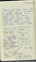
1)The first logo that I was going to create was the sketch that I design. I do this first as I get the basic ideas out and it helps for me get my more developed ideas out. The first step to making my initial logo was to use the pen tool and draw over my sketched logo. I did the box first.
2)Next I traced over the N with the pen tool then drooped it down to place into the box.
3)Then I drooped down what is the Y In this design which is only a line that is slanted, this makes a Y as the part of the N makes it look like a Y. I only place the Y slightly of centre as i realised it can also look like a X.
4)Lastly, I placed in the Maybelline text in the middle just like how I sketched it.
1)Next i wanted to play with the N and Y placement as I found it looked a bit like an X. This is why I copied and pasted down an new box and N.
2)I then placed a new Y in this screenshot. I made it a capital Y and I did this with the pen tool. I made this go in the middle of the two points of the N.
3)Then once again I placed the Maybellien text on top of the logo.
1)After I looked at the last two logos I wanted to try making my own lettering like I attempted in my first design page. To do this I used the rectangular tool and made long strips which helped me to make the lines Evan. To rotate the middle line i used the rotating tool to flip the line around. This is not going to look like my screenshot at first as you have to select the whole object then use the pathfinder tool and divide the shape then right click on it to un-group it. Once you have done this you can select the extra shapes around that the line has created and delete them so you are left with the N I am left with.
2)Next I had to play around with the Y so I once again used the same lines I made for the N. this time I changed the Y again as I liked the last one with the capital Y but I didn't like how you could see both lines of the top of the Y. This is why I made it only be one line but still in the style of a capital Y. I made this the same way i made the N using the same necessary steps.
 3)All I did in this screenshot was place a box around this lettering. I used the rectangular tool for this as well.
4)The last step to this logo was to place in the name logo but i made this one blue to though a bit of colour into the logo as they have all been quite dull just using the black and white.
1)The next logo I wanted to do was the same as the last but I played more with the colours as I liked the use of the blue in the last one. So I started with back box being a all black surface.
2)Then I copied and pasted the N ans Y logo from the last design over to my new logo but be four I could do that I had to change the colour. I did this by licking the object and clicking on the colour tap that i had open. I keeped playing around with the type of blue in till I was happy.
3) All that was left to do was to add in the name logo which I which I also changed the colour of as it wouldn't of been seen. I changed it to a white.
1)As I really liked that last logo I wanted to do another one similar but changing one little component so that I could see what one I liked better. So i created another N using the same techniques that I used last time.
2)As you can see I made this N change to have rounded edges this was the little thing that I wanted to change, to see if it made a difference.
3) I got this effect by using the (A) key to select the lines and get the extra option which you can see in this screenshot as it shows the white circle that appears. When you click and pull on this it allows you to change the roundness of the shape. IN this screenshot you can also see that i am starting to do the same on the Y.
4)This shot shows the completed lettering with the rounded edges.
5) Lastly, I added in the box with the rectangular tools and the same blue writing logo on top of the logo.
1) Then once again I wanted to see what the rounded edges looked like with the dark background. This is why I coped and pasted over the box and just changed the filled to black as well.
2)Then I coped over the N and Y changing it to blue like I did in the last logo. I have did the same steps as I talked about in them screenshots.
3) Then lastly I added in the white Mayballine text that i had used on the last dark logo. This was very quick to make as I had already done most of the work, but I think it was helpful to see.
1) With my last logo I wanted to go back to my original logo so I coped and pasted over the N and Y that I used for it and looked at it in till I came up with a way that I could try and make it work.
2)I though that making the points of the N rounded might make it look more like a N and a Y not a X. To do this I used the (A) key to get the edges rounded.
3)The first thing I did next was making the stroke a bit bigger so that it was easier to see as I didn't think it was that clear to see and I wanted it to stand out.
4)Next I wanted to put a box around it but I didn't want it to be the same as the others as that wouldn't be much of a development. This is why I added in a longer box then the last time. I did this by using the rectangular tool and I also made the stroke for the box a slightly smaller size so that the edges of the N and Y would pop out of the box.
5)Next I wanted to add in the Maybellien logo but this time I added it in to the top and bottom of this logo as I though it would look nice using the symmetry of the rectangular.
1)On this last logo I just wanted to add a background colour to this logo to see what colour looked like behind it, doing this also lets be go back into this file and play with whatever colour theme I choose to use.
2)All I had left to do was add in the logo, and I did this by copying and pasting the logo that I already made on top.


Comments
Post a Comment